In our latest edition of “The story behind the art”, we explore the history, significance and symbolism of the Japanese Mon.
We hope you find it an interesting read.
Background
Mon is a heraldic crest originally worn by Japanese nobility, their attendants and their Samurai. As well as appearing on clothing, it would also adorn objects owned or commissioned by them. The closest Western equivalent would be a coat of arms, thought the two are not related and evolved separately.
A Mon which refers to a noble family is known as a “Kamon”. These are believed to date back as far as the Civil wars of the 12th century. As these were domestic battles (as opposed to international conflicts) it was important to be able to distinguish between friend or foe. The earliest recorded example is in the Nihon-Ki (Anicent Chronicles of Japan). It sis stated here that the Empress Jingo used flags and standards emblazoned with a symbol when her army invaded Korea in 200AD
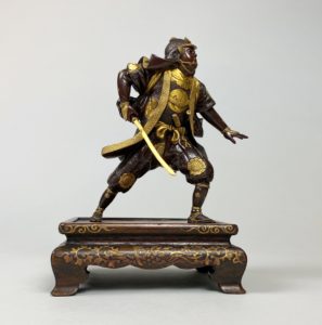
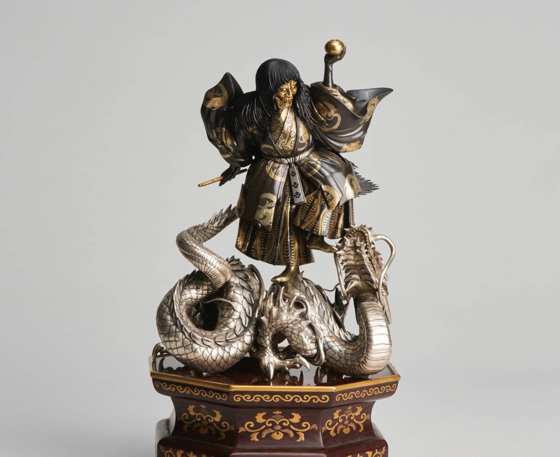
A Mon as the chest-plate on a Miyao Bronze statue from our collection
One theory suggests that Mons developed from fabric patterns used on clothes to signify membership of a specific clan or tribe. Visually this explanation makes sense as most Mon are elegantly simplistic in design and easily rendered in just two colours. This ensures that the Mon are easily printed or branded onto clothing, armoury and other objects/
Unlike the strict protocols governing European crests, the selection of the design seems to simply be the result of personal choice. Sometimes a legend would build around the design, the mon of Hojo Tokimasa (1138-1215) was said to have been formed from three dragon scales he found after seeing an apparition of the Goddess Benten seated upon her dragon.
At a time when a large percentage of the Japanese population was illiterate the simple nature of the Mon design grew in popularity and was used as a symbol for a number of things including temples, shrines, shops, merchant’s guilds, actors and their schools and even criminal organisations.
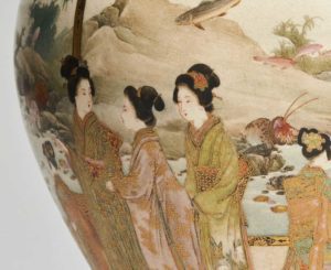
The Shimazyu Mon/Crest sitting above the signature on a fine Japense ceramic Satsuma ware vase
Modern Mon
These days most modern Japanese families will have a Mon. They are perhaps not as important as they once were, but still often play an important part in traditional ceremonies and weddings.
A woman may still wear her maiden Mon if she wishes and can pass it down to her daughters. There is no requirement to adopt her husbands or father’s mon. It is also common for more than one mon to be worn or printed on kimono. This could symbolise the husband and wife as well as perhaps a business or more formal family mon.
Modern Mon are not regulated by copyright law, with a few exceptions. The Imperial chrysanthemum with sixteen petals is exclusively for the use of the Emperor and is used as an important symbol of Japan. The Paulownia Mon of the Prime Minister is used as the emblem of the Japanese government. Over the years many Japanese Mon have been used and adapted to be used as trademarked logos for multi national companies. Some famous and instantly recognisable examples being Mitsubishi, Toyota and Japan Airlines.

A modern-day Mon, the Toyota badge.
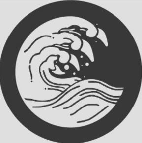
Our Logo: A Mon for Kevin Page Oriental Art
When creating our new logo for Kevin page Oriental Art, we wanted to reflect the tradition and symbolism of both Japan and China. The Mon format seemed the most elegant and logical solution.
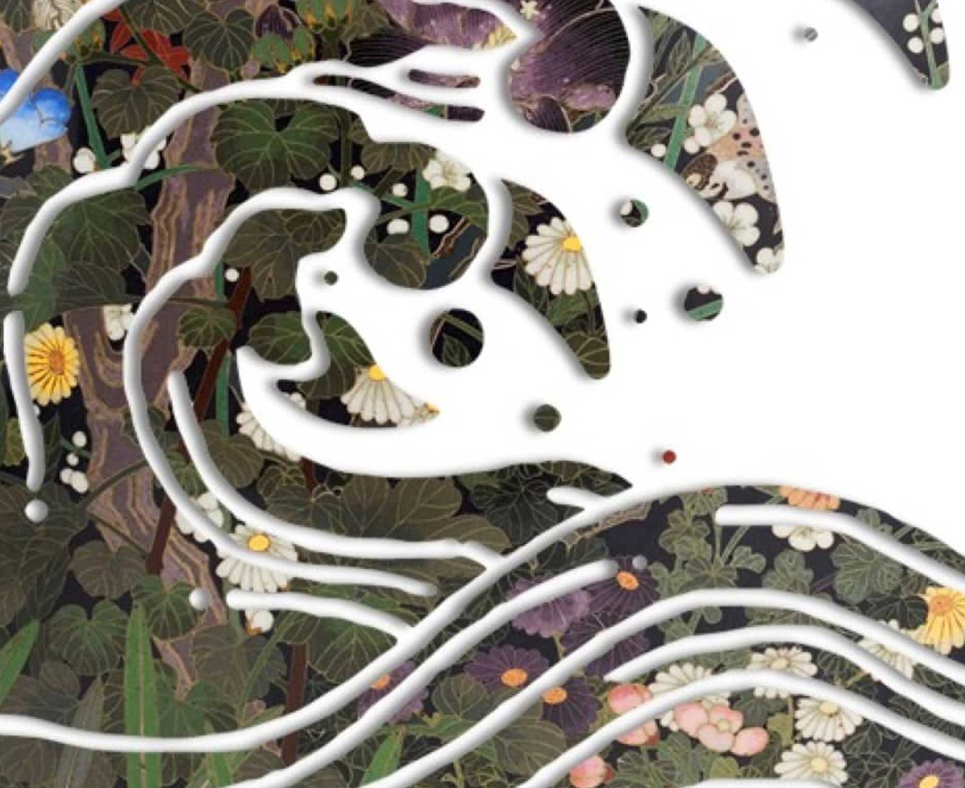
We took inspiration from Hokusai’s famous great wave print, (probably one of the best known artworks in the world and instantly recognisable as a Japanese icon), In order to represent the Chinese element of our business, we crowned the wave with the four claws of a Chinese dragon. Dragons being a creature of water associated with China and Japan this helped bring both sides of the business together.
In Chinese mythology the dragon symbolises good fortune, power and strength while in Japanese culture the wave represents perseverance, and resilience. All values that we like to think represent Kevin Page Oriental Art, the wave in particular is a reminder for how the business overcame the devastating flood at our galleries in 2016.
![]()
The Kevin Page Oriental Art crest, designed in 2020.